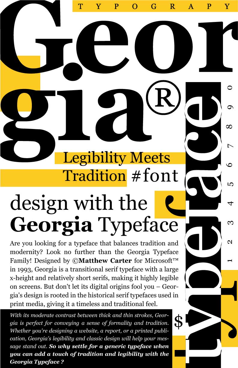
Designed in 1993 by Matthew Carter for Microsoft, Georgia was created with the intention of making text legible on screens with lower resolutions. The rise of the internet and the development of personal computers meant that text had to be legible at smaller sizes, leading to the need for a typeface that was designed specifically for on-screen use. Georgia’s design was influenced by Scotch Roman and other serif typefaces from the 19th century, but with subtle adjustments to improve its legibility on screens. Georgia was named after a tabloid headline: “Alien heads found in Georgia”.
Georgia’s design was a response to the technical and historical context out of which it emerged. It was designed for use on screens, taking into consideration the lower resolution of monitors at the time. Georgia’s design was also influenced by the traditional serif typefaces used in print media, but with adjustments to make it more legible on screens. Some notable uses of Georgia include its use as the default serif typeface in Microsoft Word, and its use on the website of The New York Times.
Georgia is a transitional serif typeface, with moderate contrast between thick and thin strokes, and relatively short serifs. It has a large x-height, meaning the height of the lowercase letters is relatively large compared to the overall height of the typeface. This makes it more legible on screens at smaller sizes. Georgia’s connotations include tradition, formality, and readability. Its design is rooted in historical serif typefaces, but with a modern twist to make it more legible on screens.


Leave a Reply