Your cart is currently empty!
How to Match Pantone/Freetone in Illustrator: A Simple Guide
Matching PANTONE® or Freetone shades in Adobe Illustrator is essential for designers aiming for color accuracy in branding, printing, and digital projects. Follow these easy steps to get it right every time.
Recently my joiner graphic designer friend asked me how to find related pantone color code for his branding manual, more than that he didn have had a pantone color palette because new adobe illustrator 2024 doesn’t come with pantone pallet (Reason as Pantone indicates that Adobe basically refused to pay for access to the color charts, Adobe’s Pantone color libraries have become outdated and inaccurate, and this leading to frustrating and expensive print issues for designers. so now it is not there anymore)
Freetone:A simple & totally free colour palette plugin for Adobe that unlocks a whole books worth of very Pantone-ish colours.
Step 1: Create a Color
Launch Illustrator and Draw two color blocks, using Rectangle tools(M) and will with same color. I’m going to name them as CMYK and Pantone
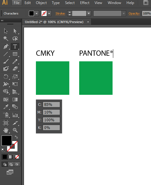
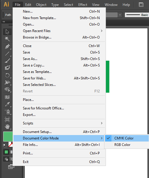
Make sure you in CMYK color mode by visiting File-> Document Color Mode -> CMYK Color
Ensure your document’s color mode matches your project requirements:
- Use CMYK for print projects.
- Use RGB for digital designs.
Step 2: Fetch the Pantone colour
Click the hamburger menu (top-right corner of the Swatches panel) and select “Open Swatch Library” > “Color Books.” Here, you can choose from various Pantone or FreeColor libraries like Pantone Solid Coated or FreeColor Standard .
Now it is the time to find the pantone of my CMYK color
This CMYK color i’m going to use for Business Card print on 350gsm art matte paper which is a coated paper (Coated paper lets the ink settle on the surface, thanks to which the color is deep and vibrant. Uncoated paper absorbs the ink, which makes the color dull and not as prominent)
Pantone Coated Color palette code comes with the “C” suffix ex, Pantone 523C, so my color code in Pantone Coated Color palette,
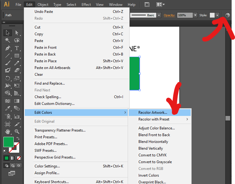
Lets find out, select our second green rectangle
and go to EDIT-> Edit Colors-> Recolor Artwork panel
Step 3: Search for Your Desired Color
Once you’ve get the Recolor Artwork panel, select your desired Color pallet, for this time i need Pantone Coated Palette
I have multiple palettes, i go with PANTONE CMYK Coated
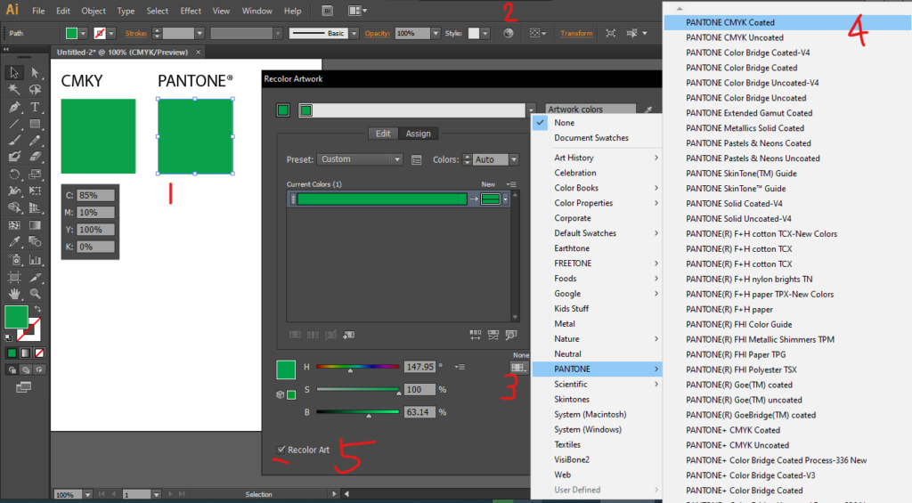
Make sure you checked the Recolor Art (5) in the panel, and hit OK
Tada! Now you Green color box changed to Pantone color, some times you can’t see the deferent (or magically you found the exact same Pantone color that has the same CMYK color value ) , but it is there
Step 4: Verify Pantone Color
Go to Color Panel Windows-> Color (F6)
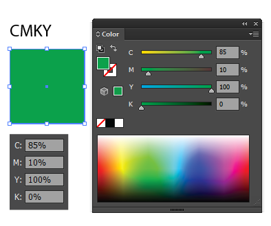
And Click the CMYK box, You can see CMYK Values on Color panel
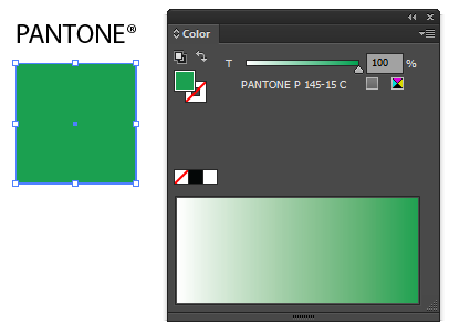
if you click Pantone Color Box, the color panel shows Pantone code instead of CMYK Value
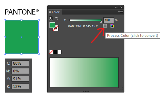
in case you need to observe CMYK value of this pantone code (P 145-15C), just click the grey icon next to Pantone color code, it will reveal the value behind the Pantone code, which may slightly be different from the original CMYK that you first make, but when you print this on coated paper, you can get a similar color
Step 5 (Bonus): Make Color info card
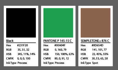
If your adobe illustrator is version 29.1 or higher, you have a new feature to generate you color code, this is very useful when you are making Branding Guidelines, Profiles etc
Remove unused colors by Swatches – > (Right hamburger button) Options->Select All Unused and hit the delete icon (3)
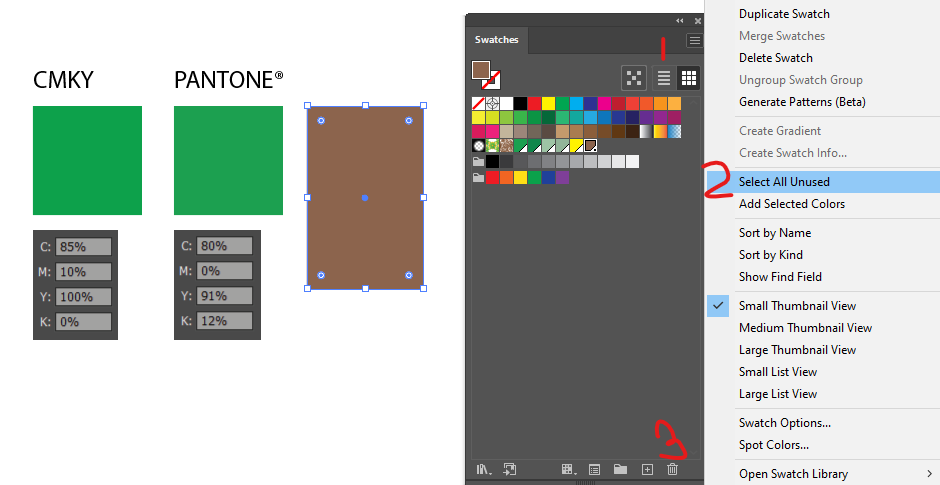
and for the remaining swatches, select your swatches by Ctrl+click (for mac Cmd+ Click) (Unfortunately i couldn’t find a way to do this to one swatch, may be i just missed the option, comment if you find)
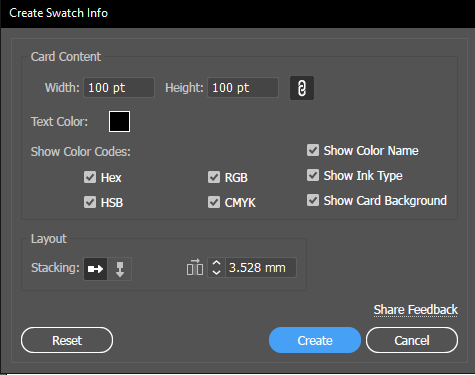
and then again Swatches – > (Right hamburger button) Options-> Generate Swatch info..
this will give formatting option, you can play around with it, I’ll keep its defaults, and hit Create
then you will get well formatted color cards, you can place it where you want
Pro Tip: Use the Eyedropper Tool
For existing designs, use the Eyedropper Tool (I) to sample colors and check their Pantone/FreeColor equivalent under the “Recolor Artwork” option.
Why Matching Colors Matters
Accurate color matching ensures consistency across brand materials and avoids costly printing errors. By mastering Pantone and Freetone(new people adapting to this palette) in Illustrator, you can deliver professional grade designs every time.
Need Help with Graphic Design?
Whether you’re working on logos, packaging, or marketing materials, our team of expert designers ensures your vision comes to life with precision. Contact us today for stunning, on-brand designs!


Leave a Reply