Your cart is currently empty!
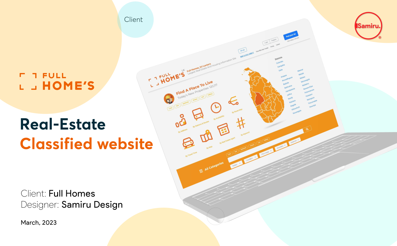
Real Estate Classified website – UX Design

The problem
The currently available classified websites have designs that are cluttered, systems for browsing through products that are inefficient, and checkout processes that are confusing.
The goal
Create a new classified website with a user-friendly design that includes clear navigation and a fast live chat process to enhance the user experience.
User research
As a UX designer, it is crucial to conduct user research to create a successful Classified website. This process allows us to gain insights into the needs, behaviors, and pain points of our target audience, which helps us design solutions that meet their specific needs and improve the overall user experience of the website.
User research: pain points
Difficulty finding what they are looking for
Users may find it difficult to search for items they want to buy or sell, either because the search function is not user-friendly or because the app does not have enough categories to filter by.
Lack of trust in the platform
Users may not trust the authenticity of the items being sold, or the reliability of the buyers and sellers. This may prevent them from using the app or making a purchase.
Inadequate payment options
Users may not be comfortable using the payment options available on the app, or they may find that the options are limited or inconvenient.
Poor customer support
Users may need assistance with using the app, or they may encounter technical issues that need to be resolved. If the app does not have adequate customer support, users may feel frustrated and discouraged from using the app in the future.
Persona: Priya
Problem statement: Priya, is a homemaker who need a user-friendly platform because she need buy product easily
User journey map
Priya’s user journey map shows steps that he takes to achieve his goals, and to identify any pain points or areas for improvement in the overall experience, so that we can create a more seamless and enjoyable experience for the user.
Sitemap
Difficulty with website navigation was a primary pain point for users, so used that knowledge to create a sitemap.
My goal here was to make strategic information architecture decisions that would improve overall website navigation. The structure I chose was designed to make things simple and easy.
Paper Wireframe
Paper wireframes: Use simple approach to ad browsing and publishing through website
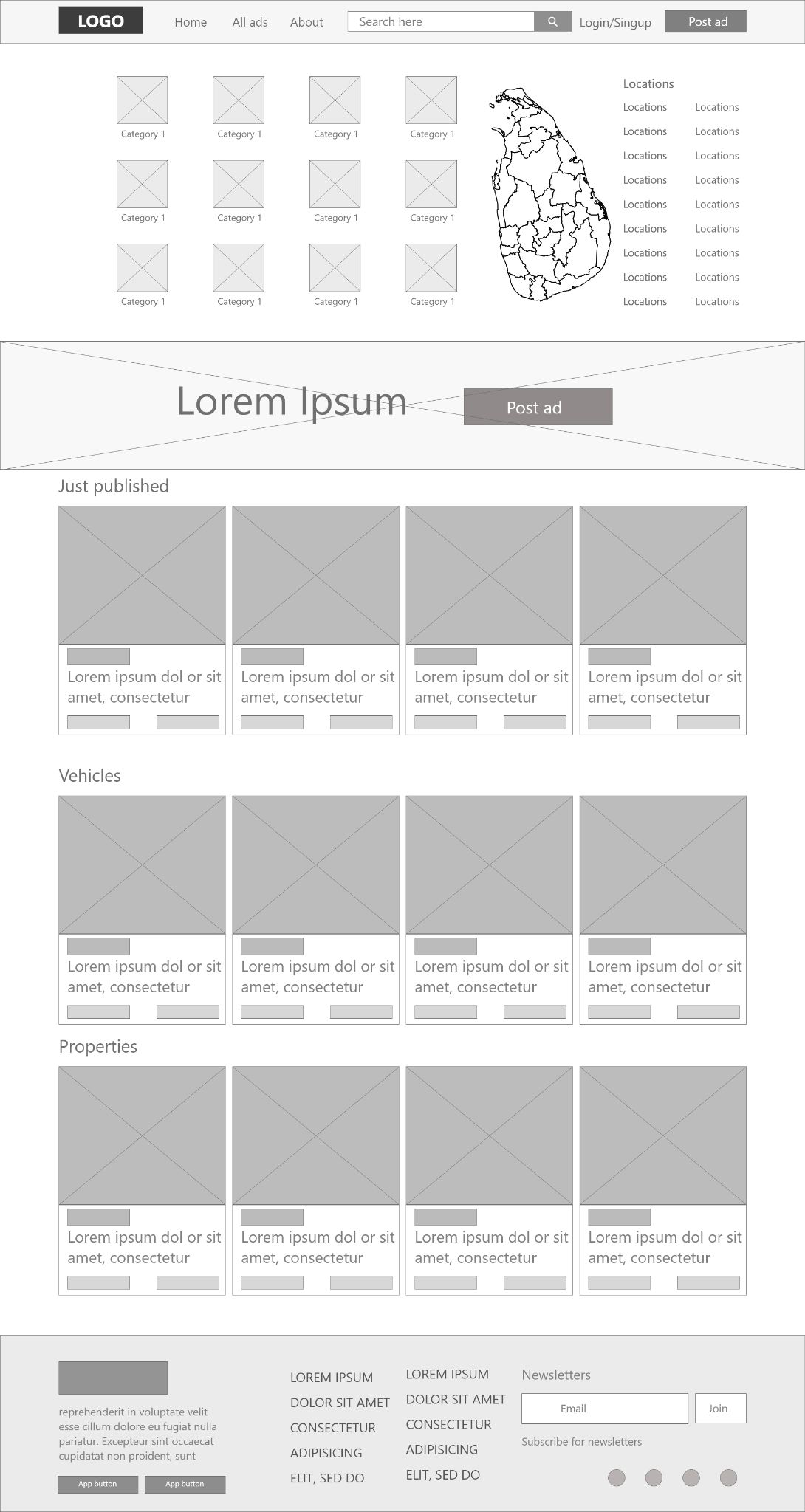
Digital wireframes
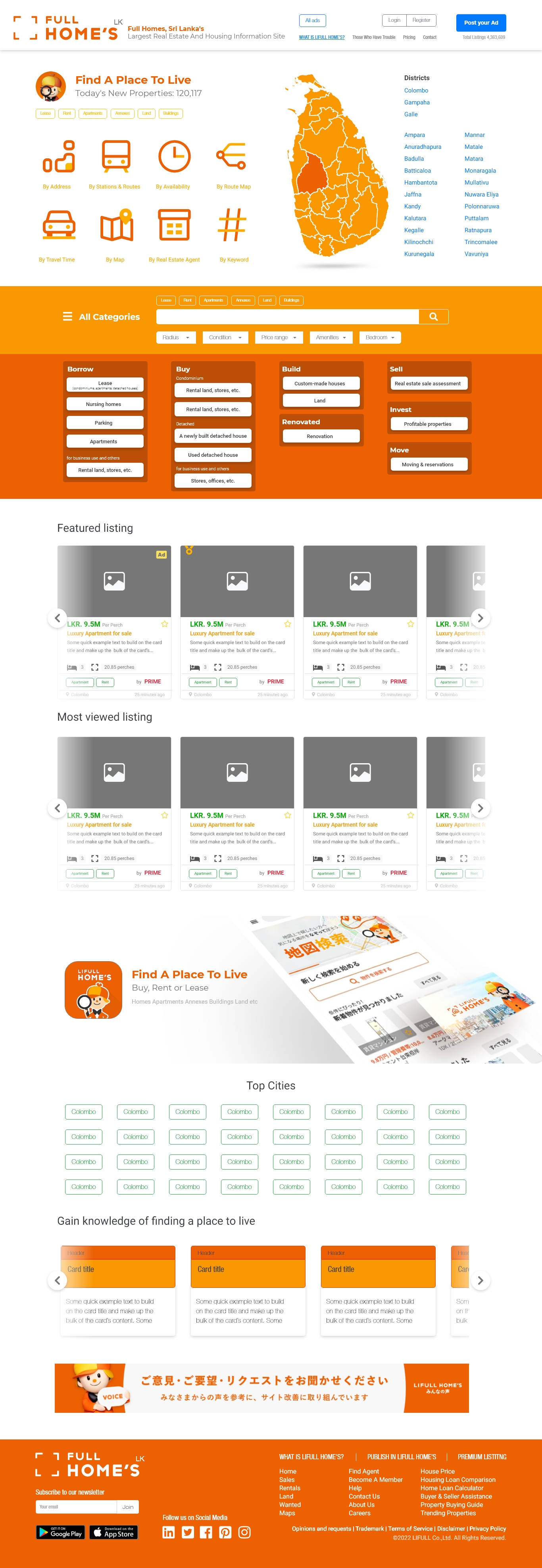
The transition from paper to digital wireframes facilitated a better understanding of how a redesign could tackle user pain points and enhance the user experience. The strategy prioritized the placement of buttons and visual elements on the home page to ensure maximum usefulness.
Low-fidelity prototype
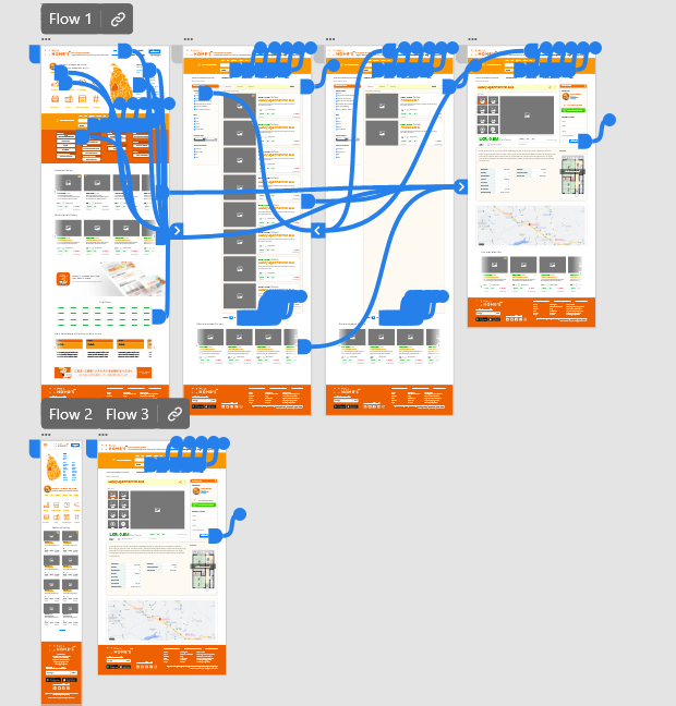
To produce a low-fidelity prototype, I linked together all the screens that were part of the main user flow for adding an item to the shopping cart and completing the checkout process.
Usability study: findings
Here are the primary discoveries revealed by the usability study:
01
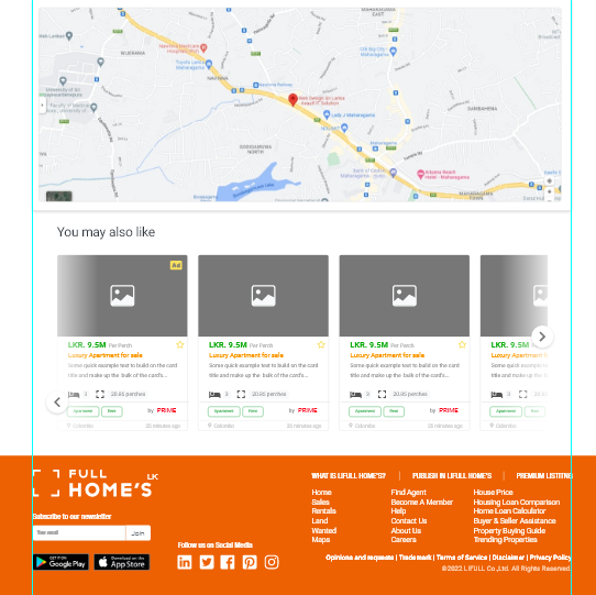
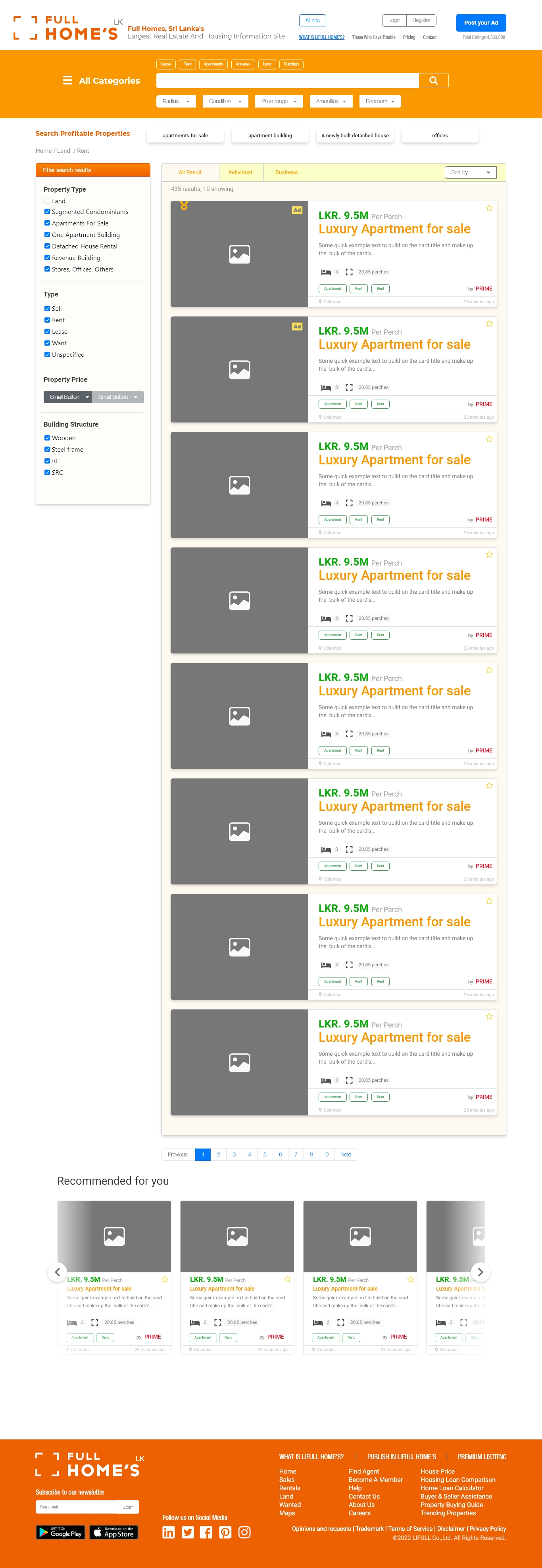
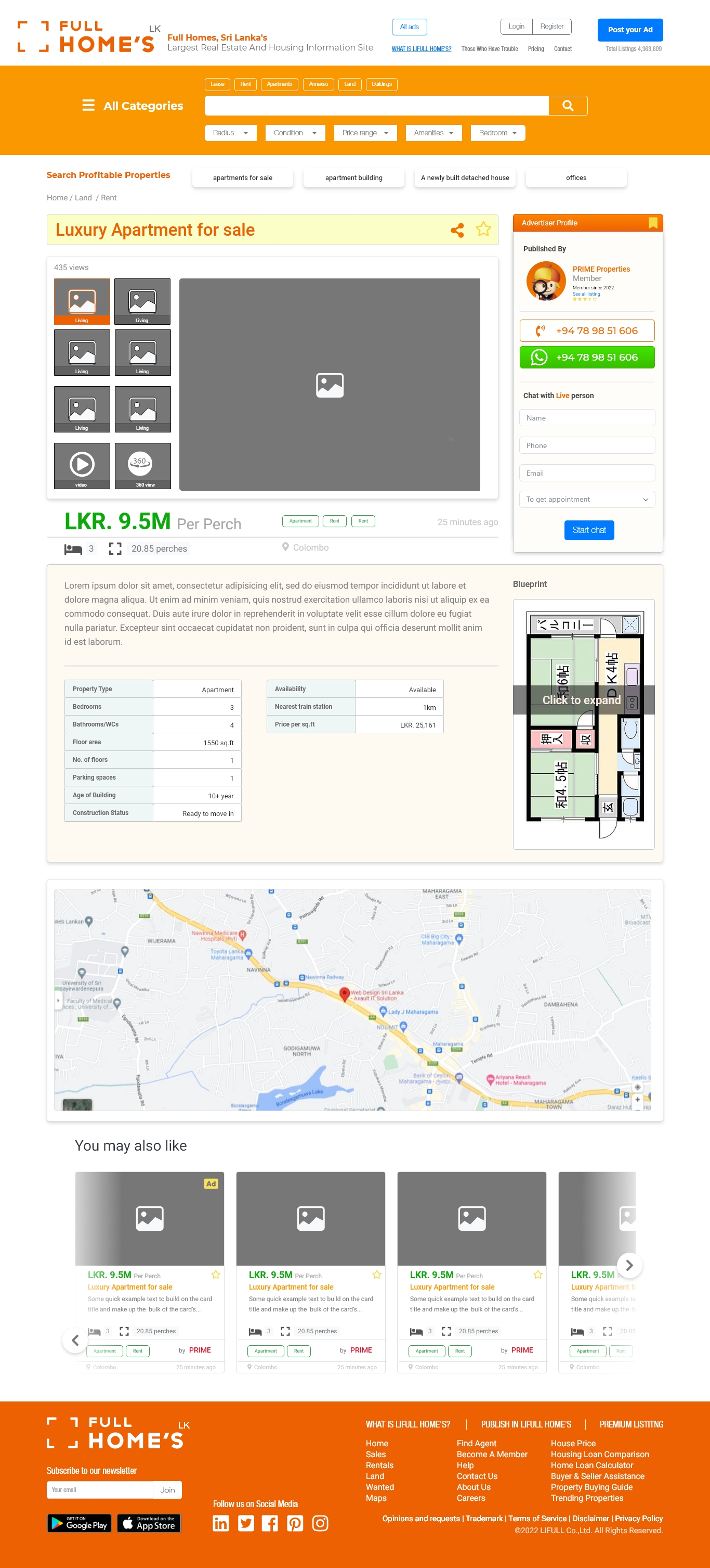
Related ads : Uses like to see realtated ads beneath the current ad
02
Whatsapp button : Users want instant CTA button to get in touch with seller, whatsapp button can do that
03
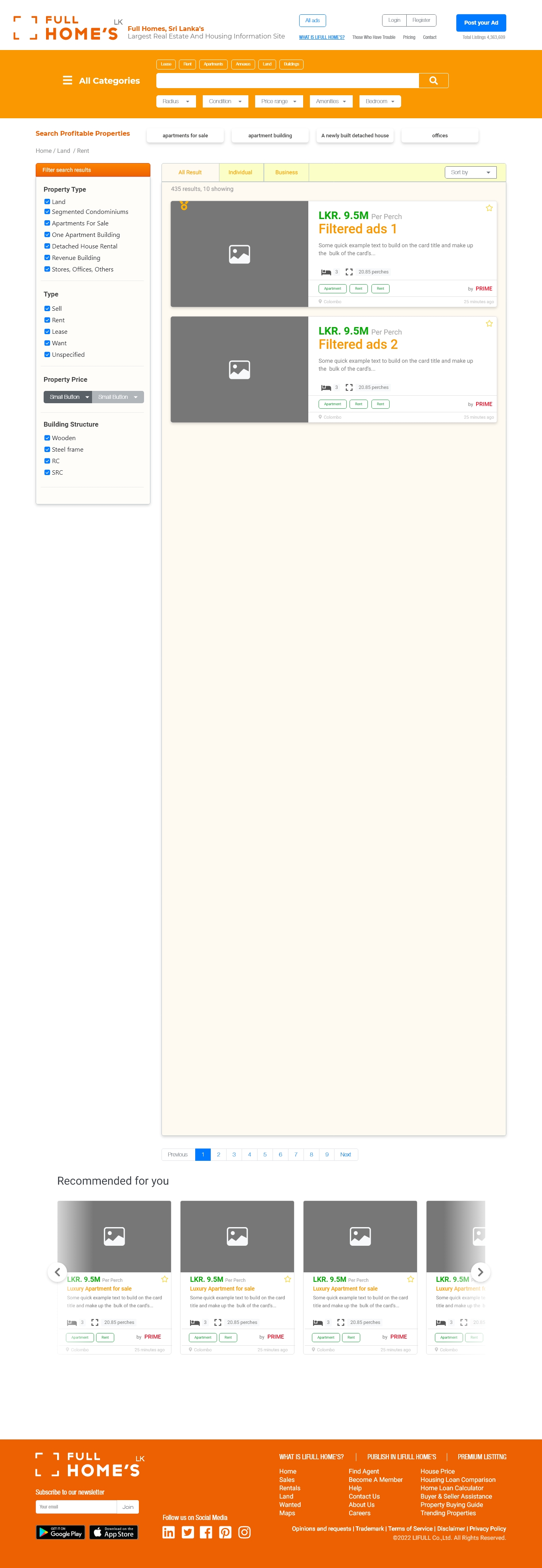
Autosuggest search : Users can modify their search query in real time and search result oriented queries
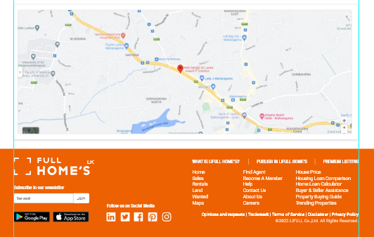
Mockups
users are interested in seeing advertisements that are related or similar to the advertisement they are currently viewing. For example, if someone is looking at an ad for running shoes, they may be more likely to engage with related ads for workout clothes or fitness accessories.
High-fidelity Prototype
After incorporating the design changes suggested by the usability study and feedback from my team members, my hi-fi prototype followed the same user flow as the lo-fi prototype.
Accessibility considerations
01
We have incorporated accessible design practices into the UX design of our classified website. For instance, we provide alternative text descriptions for images and ensure adequate color contrast for users with visual impairments
02
Efforts have been made by the design team to ensure that the classified website is compatible with assistive technologies, such as screen readers and keyboard navigation.
03
Moreover, the website font size and spacing have been optimized to enhance readability, and clear labels have been implemented to facilitate users with cognitive or language barriers.
Takeaways
Impact
The positive impact of our UX designs for the website is evident in the feedback from users, who report an improved experience in finding and posting classified ads. In fact, one study participant even commented that the website is simple and fast to use, with rich functionalities.
What I learned
The classified website project has taught me the significance of carrying out thorough research to comprehend the requirements and actions of various user groups. Additionally, I have obtained valuable knowledge about the design process, such as the importance of incorporating accessibility considerations and the iterative approach to design
Next steps
01
To ensure a seamless user experience, I will prioritize the identified usability issues and redesign the website’s interface. I will incorporate accessibility and inclusivity for all users into the design process.
02
I would also aim to continually iterate and improve the website’s design through user testing and feedback. By regularly collecting user feedback and data, we can identify areas for improvement and make necessary changes to enhance the user experience.
03
In addition, I would work on developing a style guide and design system for the website to maintain consistency and ensure a cohesive user interface across all features and functions of the website.
Thank you for your interest in Full homes real estate website’s UX design. Please feel free to contact me with any questions.
© Samiru Samarakoon
samiru.design.blog
+94 78 98 51 606

 US Dollars
  Dirham